Branding: Put on a consistent face
ZCorp PRDigital • April 29, 2020
Make your standards crystal-clear to everyone in your company

If you’re a business owner, you’re probably very busy – a constant swirl of activity. You have bills to pay, prospects to engage and operations to oversee. Branding
probably isn’t extremely high on the list of priorities.
It should be.
Branding is the face you put on your company to show the world. It says a lot about your organization and it makes an impression, whether positive or negative. It defines who you are and the company you keep: what you stand for, the relationships you’ll build, the activities you’ll support.
So, just what are we talking about here? Branding is a carefully crafted body of guidelines and rules that regulate the “look and feel” elements of your business. They encompass the logo, typography, color palette, descriptions and other aspects of what you show the public.
These guidelines
give your brand continuity, consistency. Standardization is important in an organization where many people touch the brand. You don’t want two people sending out conflicting versions of the logo or the company description. When that happens, it diminishes some of the company’s public integrity, suggesting that your attention to detail isn’t as sharp as it might be. It also presents different versions of what you want people to see.
Consumers know the logos of famous brands, such as Coca-Cola
and Google, and that familiarity engenders confidence. Start sending mixed messages about the brand and that confidence erodes. Uniformity is a virtue. An ever-changing brand – even if the changes are slight – is not.
In the absence of a clearly delineated set of standards, it’s hard for a business to maintain brand integrity. Whether a printed-out document or a PDF file, it’s important to spell out all the particulars of the brand.
Within that document, you should include the logo and its variants (if any). Specify whether any text is allowed to be included in or near the logo – a slogan, for example. Spell out the precise distance all text and other elements must be from your logo. You may decide that the height of a horizontal logo is a good yardstick for how far other elements should be from the logo itself.
It’s often helpful to include several “what not to do” examples in your style guide. For example, you can picture the logo too close to other content, with the wrong colors or containing other branding violations.
Colors are critical when it comes to branding. List the PANTONE
colors, the RGB(red, blue and green), CMYK(cyan, magenta, yellow and black) and hexadecimal
color codes. If this is an area foreign to you, get the help of a graphic designer to determine these designations.
List the fonts that are acceptable for use, too. And write a boilerplate
that describes your company for inclusion in all your press releases, unaltered.
Remember, if you need help with your branding or composing a body of standards, don’t hesitate to contact Z Corp PR & Digital. We can guide you through the process.

Learn how consistent brand messaging builds trust, strengthens brand recognition and creates a cohesive experience across marketing, PR, and digital channels.

Learn how Z Corp PR supports executive thought leadership through PR, content strategy, SEO, and digital marketing in Melbourne, FL.

Crisis communication planning best practices to help small businesses respond quickly and effectively during a PR crisis. Crisis communications are the strategies that organizations use to protect their reputation during unexpected events, negative publicity or operational disruptions. In today’s fast-paced, digital-first business environment, a PR crisis can emerge at any time and in any industry. From associations to service providers, how a company responds in the first few hours of a crisis often determines whether the issue escalates or is effectively contained. At Z Corp PR & Digital , a leading public relations agency in Melbourne, FL , we help organizations plan for these crisis situations and navigate them with clarity, speed and strategy. What Is Crisis Communications and Why a Crisis Communication Plan Matters Crisis communications ensures that stakeholders - customers, employees, partners and the public - receive accurate, timely and consistent information during a challenging situation. Effective crisis communication helps organizations: Maintain trust and credibility Control misinformation Reduce reputational and financial damage Demonstrate leadership and accountability It also plays a critical role in long-term reputation management . How an organization communicates in a crisis can shape public perception long after the issue is resolved. Proactive, transparent messaging helps protect brand equity, rebuild confidence, and prevent a single incident from defining your organization. Preparing for a PR Crisis: Key Best Practices Preparation is the cornerstone of effective crisis management. Every organization, regardless of size or industry, should have a documented crisis communication plan in place. Best practices include: 1. Identify PR Crisis Risks Early Assess business operations, leadership decisions, customer touchpoints and regulatory exposure to anticipate potential crisis scenarios. 2. Develop Key Messages to Protect Your Brand During a PR Crisis Create pre-approved messaging that is clear, concise, and aligned with your brand values. These messages should address: What happened What the organization is doing What stakeholders can expect next 3. Train Your Team for Crisis Response Ensure spokespeople, social media managers and any customer-facing staff understand response protocols, approval workflows and timing expectations. 4. Monitor Digital Channels to Prevent PR Issues Track conversations across social media, forums, review sites and news platforms to detect early warning signs before issues escalate. Organizations that prepare in advance can respond quickly and confidently, preserving stakeholder trust and minimizing long-term impact. Real-World Crisis Communication Examples Across Industries Crisis communication challenges vary by industry, but the principles remain consistent. Associations may face backlash over policy decisions or regulatory positions. Franchises can encounter localized incidents that quickly affect national brand perception. Service-based businesses , including healthcare providers and restaurants, often deal with customer complaints that gain traction online. Tech B2B companies may confront data breaches, platform outages, product vulnerabilities or customer trust issues that impact enterprise clients and partners at scale. In each case, organizations that respond promptly with transparency - acknowledging the issue and outlining corrective actions - are more likely to emerge with their credibility intact. In many situations, a well-handled response can even strengthen brand trust. The Role of Digital Monitoring in Crisis Management Digital monitoring is no longer optional - it is essential. By using tools that track brand mentions, sentiment, and emerging trends, organizations can: Identify potential crises in real time Respond before misinformation spreads Engage directly with concerned audiences At Z Corp PR & Digital , we integrate digital monitoring and social listening with strategic messaging and content creation to ensure our clients communicate effectively when it matters most. This proactive approach helps brands maintain integrity while addressing stakeholder concerns head-on. Partnering With a Local PR Expert for Crisis Communications Managing a crisis requires more than quick reactions - it requires experienced guidance. Partnering with a trusted public relations firm in Brevard County, FL ensures your organization is prepared before a crisis occurs and supported when one does. From monitoring and messaging to video production and SEO-driven content, Z Corp PR & Digital provides comprehensive solutions designed to protect and strengthen your brand. Crisis Communications Takeaway Proactive planning, clear messaging and real-time digital monitoring are all important parts of effective crisis communication. Whether your organization is an association, franchise, or service provider, following these best practices can prevent reputational damage and reinforce stakeholder trust. Learn more about how Z Corp PR & Digital can help your organization prepare for and respond to a PR crisis at www.zcorppr.com .

Today’s customers don’t interact with brands in just one place. They may see a social media post in the morning, read an article later that day, encounter an online or print ad, and visit a company website - all before making a single decision. When public relations, content, and social media marketing in Melbourne, FL work together, those experiences feel connected, and that’s where real results happen. What Is an Integrated PR and Marketing Campaign? An integrated PR and marketing campaign aligns your public relations, social media, and content efforts around one clear message and goal. Instead of running separate campaigns on different platforms, everything works together as one cohesive story. This approach creates a stronger, more recognizable brand presence and helps customers better understand who you are and what you offer. How Integration Helps Your Marketing Go Further One of the biggest benefits of integration is that it makes every effort more efficient. An article doesn’t have to stand alone, it can be shared on social media, referenced in blog posts, linked in an email newsletter, and even used by sales teams. The same message reaches more people, in more places, without starting from scratch each time - an approach often guided by an experienced branding agency in Melbourne, FL . Clearer Insights and Better Performance Tracking Integrated campaigns also make it easier to see what’s working. When all channels are aligned, businesses can more clearly track increases in brand awareness, website visits, and inquiries, rather than measuring each effort separately. This makes it easier to refine strategy and invest in what delivers results. Why Consistency Builds Stronger Brands Across industries, integrated PR and marketing consistently drive stronger outcomes. Product launches gain more visibility. Brand announcements receive more attention. Ongoing marketing efforts build trust more quickly. Most importantly, customers receive a clear, consistent message no matter where they encounter a brand. Setting Integrated Marketing Up for Success Successful integration starts with a clear message and a well-planned campaign across all channels and teams. When public relations, content, and social media are aligned from the beginning, marketing becomes more efficient and effective. In a world where customers are surrounded by information, consistency helps cut through the noise. Integrated PR and marketing campaigns help businesses tell a clear story, build stronger relationships, and support long-term growth through thoughtful digital marketing in Brevard County. Z Corp PR & Digital helps a diverse range of businesses, including tech companies across the globe, industrial sector companies throughout the United States, and retail/service providers locally in Florida (Melbourne, Palm Bay, Brevard County and beyond) tell their story with clarity and purpose. By aligning public relations, content, and social media under one cohesive strategy, we create integrated marketing campaigns that build brand awareness, strengthen credibility, and drive meaningful growth. Our collaborative approach ensures every touchpoint works together to deliver consistent, impactful messaging. Contact us today to learn how we can help you grow your business!

In a crowded marketplace, the brands that stand out aren’t the loudest - they’re the ones that tell the best stories. Storytelling is one of the most potent tools of PR and marketing. It builds emotional connection, communicates purpose and inspires loyalty. At Z Corp PR & Digital, every brand has a story worth telling - the key is how you share it. The power of storytelling Great storytelling brings your brand to life and helps people connect with it. Not only that, it also: Humanizes your brand by showing its purpose and personality. Builds trust through authenticity and consistency. Differentiates you by leading with why , not just what . Engages audiences through emotion and meaning. Storytelling transforms communication from messaging into strategy , giving your brand clarity and cohesion across every channel. From values to voice Before telling your story, define it. Start with your mission, values and the people who bring them to life. A compelling brand story blends three essentials: Purpose: The “why” that fuels your organization. Proof: Actions and results that make your message credible. Personality: The tone and humanity that make it memorable. When these align, your story becomes culture, shaping how you speak, what you stand for and how audiences perceive you. Bringing it all together A compelling brand story grows and evolves, bringing teams together, engaging audiences, and building reputation. At Z Corp PR & Digital , we help organizations discover their narrative and share it with clarity, consistency and impact. Whether launching, refreshing or redefining your brand, our team brings the strategy and creativity to make your story resonate. We offer a full range of services , including digital marketing, video production, PR, social media, and much more. Based in Melbourne, FL, we serve clients across the U.S. and beyond, helping brands grow and connect with audiences everywhere. Let’s craft your next chapter together.
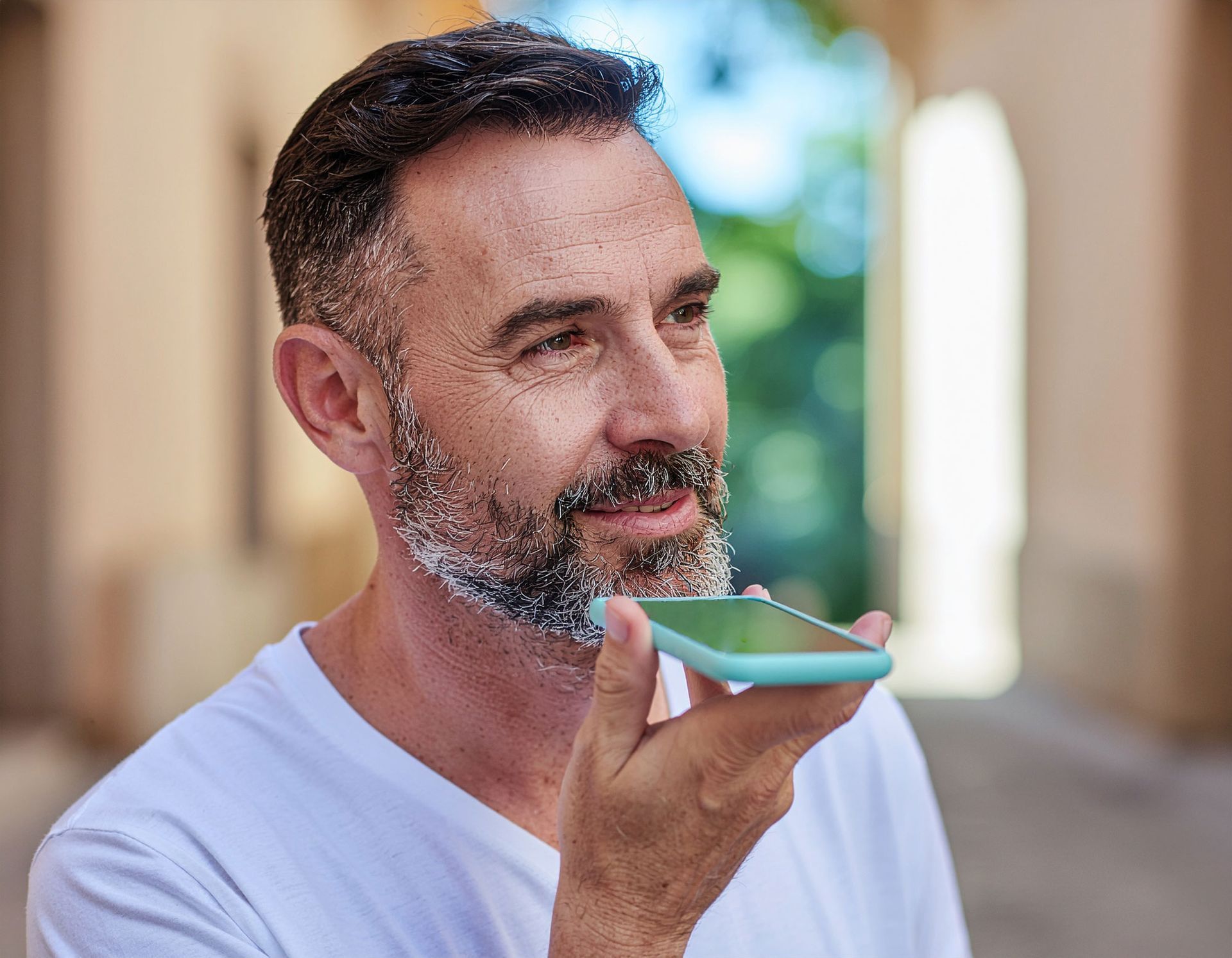
Voice search is a technology that lets people use the spoken word to search for information instead of typing on a keyboard. It works through virtual assistants like Siri, Alexa or Google Assistant, which listen to spoken questions and answer them aloud or show results on the screen. For example, instead of typing “best pizza near me,” someone might say, “Hey Siri, where can I find the best pizza nearby?” This way of searching is growing rapidly because it's faster and more convenient, especially when people are driving, cooking or multitasking. Voice search also makes the internet more accessible for individuals who find typing difficult. Because voice queries are more conversational and natural, businesses need to adjust their online content to better match how people speak. That means using full sentences and questions rather than just keywords. In short, voice search is changing how we find information online and is becoming an important part of modern digital marketing. SEO is evolving fast with the rise of this technology. Optimizing for natural language is now essential for reaching customers in 2025. Websites need to shift from short keywords to longer, question-based phrases . And they should address queries in natural language. To stay visible, businesses need to adopt FAQ pages and clear summaries to target voice-first results. Optimizing for local intent is especially crucial, since most voice queries are for nearby businesses. Mobile usability, page speed, schema markup and voice-friendly content structure are now baseline essentials for SEO success. Voice search will account for more than half of all queries this year , driving major change in marketing SEO practices. By adapting content for natural language, smart devices, and conversational intent, brands gain a decisive edge as voice-driven search becomes the norm.

In today's digital landscape, authenticity has become a cornerstone of effective marketing. Consumers are more discerning than ever, seeking genuine connections with brands rather than polished facades or empty promises. Here’s why authenticity matters and how it can transform your marketing strategy. Why authenticity resonates First of all, authenticity builds trust . People can spot a fake a mile away. Authentic brands make customers feel valued and understood. When messaging aligns with real values and actions, audiences are more likely to engage and remain loyal. Authenticity also drives engagement. Content that feels real (user-generated posts, behind-the-scenes glimpses or honest storytelling) encourages interaction and sharing, amplifying your reach organically. In a crowded marketplace, authenticity sets you apart . Brands that embrace their unique voice stand out from competitors relying on generic messaging. Practical ways to be authentic One way to help achieve authentic marketing is to showcase real stories. Highlight customer testimonials, employee experiences and real-life case studies. Let your audience see the people behind the brand. Invite customers to share their experiences with your products or services. This not only provides social proof but also strengthens community. Also, be transparent when communicating with the public. Admit any mistakes, share your journey and communicate openly about your processes and values. Transparency fosters credibility. The bottom line Authenticity isn’t just a buzzword. It’s a powerful driver of trust, loyalty and long-term success. By embracing genuine communication and celebrating real stories, brands can build meaningful relationships that go beyond transactions and create lasting impact.

In today’s business environment, conveying your message via clear and effective writing is critical. Unfortunately, many professionals overlook the importance of tailoring their writing to a specific audience. This common mistake can result in miscommunication and many lost opportunities. Every piece of business writing , whether it’s an email, report or proposal, has a specific audience. The group can vary widely. That's why it's so important to consider the different needs and levels of understanding within a given audience. When you don’t tailor your message to your recipients, you may fail to get your point across. For example, using overly technical jargon can leave people confused if they're unfamiliar with your field. On the other hand, being too simplistic with experts can come across as patronizing. The key is to strike the right balance: Use language, tone and details that resonate with your readers. Before you hit “send” or “submit,” take a moment to ask yourself: Who will read this? What do they need to know? What is the best way to communicate this information to them? Develop a mental checklist. By keeping your audience in mind, you’ll connect more effectively and achieve better results in your business communications. Z Corp PR & Digital specializes in crafting clear, concise written communications tailored to your target audience. Our team combines industry expertise with strategic messaging to ensure your message is well-written, resonating with the right people at the right time. Whether you need press releases, digital content or internal communications, we work closely with you to understand your goals and deliver results. Contact us today at (321) 213-1818 or info@zcorppr.com to discover how we can upgrade your communications and help you do more business.

Despite the ever-evolving digital landscape and the rise of new social platforms, Facebook remains a cornerstone for business marketing in 2025. Here’s why Z Corp PR & Digital continues to recommend Facebook as an essential channel for brands seeking growth, engagement, and results. Unmatched Global Reach and Local Impact With over 3 billion monthly active users, Facebook is still the most-used social network worldwide . This massive audience spans all demographics, providing businesses with unparalleled access to potential customers—whether you’re targeting a local neighborhood or launching a global campaign. Geo-targeting tools allow brands to tailor messages to specific communities, ensuring relevance and higher engagement. For small businesses, features like Facebook Groups and local events foster genuine connections and drive word-of-mouth marketing. Proven ROI and E-commerce Power Facebook’s advertising ecosystem remains robust. In 2025, worldwide ad revenues are projected to hit $116.53 billion, making Facebook the second-largest digital ad platform globally . For marketers, this translates to confidence: 67 percent of those using social listening report strong ROI from Facebook campaigns, ranking it ahead of TikTok and X, and just behind LinkedIn and Instagram. Notably, 38.5 percent of U.S. Facebook users are expected to make a purchase on the platform this year, with Marketplace and Shops driving significant social commerce activity . Facebook Marketplace alone boasts 250 million sellers worldwide, and nearly $94 million in social commerce is estimated to be generated on the platform in 2025. Advanced Targeting and Automation Facebook’s sophisticated targeting tools—such as Audience Insights, lookalike audiences, and behavioral data—enable businesses to reach the right people at the right time. Automated features, like Advantage+ campaigns, optimize ads for maximum impact, while Messenger and WhatsApp integrations streamline customer communication and support . These capabilities ensure that both organic and paid strategies are effective and scalable. Content Versatility and Engagement While engagement rates have shifted, Facebook’s evolving content formats—especially Reels, Live videos, and Stories—drive meaningful interaction. Live videos now receive 6x more engagement and 38 percent more views than standard videos, and Reels are watched daily by half of young Facebook users. Brands that leverage these formats, along with behind-the-scenes content and community-driven posts, see higher reach and loyalty. Real Results: Case Studies and Success Stories From global giants to local businesses, Facebook delivers measurable outcomes: Pandora achieved a 61 percent lift in purchases and a 42 percent increase in new buyers with a targeted video campaign . Samsung saw a 500 percent ROI and a 7 percent increase in new customers through a multi-stage Facebook video strategy. Church’s Chicken drove more than 592,000 store visits and an 800 percent ROI by targeting locals with dynamic ads. In a recent case study, a client doubled their sales using a mix of optimized posting times, engaging video content, and Facebook Shops for seamless e-commerce. The Bottom Line Facebook’s combination of scale, targeting, versatility, and commerce tools makes it indispensable for businesses of all sizes. Whether you’re building brand awareness, driving sales, or nurturing a loyal community, Facebook remains a dynamic platform that adapts to changing user behaviors and marketing trends. For Z Corp PR & Digital clients, it’s not just about being present on Facebook—it’s about leveraging its full suite of features to achieve real business results. Ready to elevate your brand’s Facebook strategy? Let’s connect and make it happen.